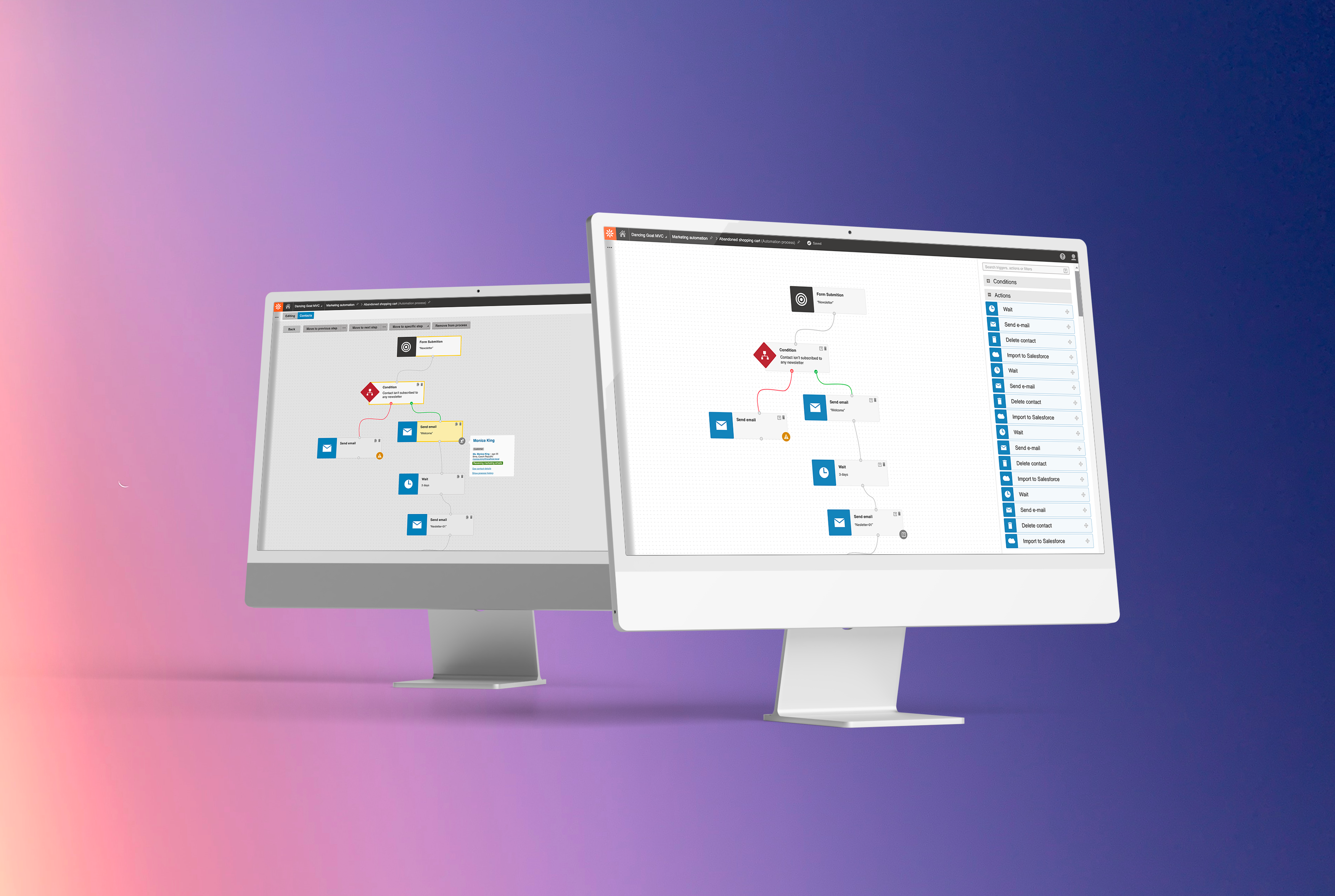
Marketing Automation
Company
Kentico software, s.r.o.
Segment
B2B · SaaS · Content Management System (CMS) · DXP (digital experience platform)
Timestamp
2019-2020
My role
Product discovery support, research, interaction design and visual design
Achievements
100% of problems of high impact solved & overall great feedback
Challenges
“Big bang” release (release once a year) and slow adoption of new product version
Marketers hate manual, repetitive jobs. They want to be creative!
That’s why we wanted to make help them automate marketing channels efficiently so they focus on more fun stuff.
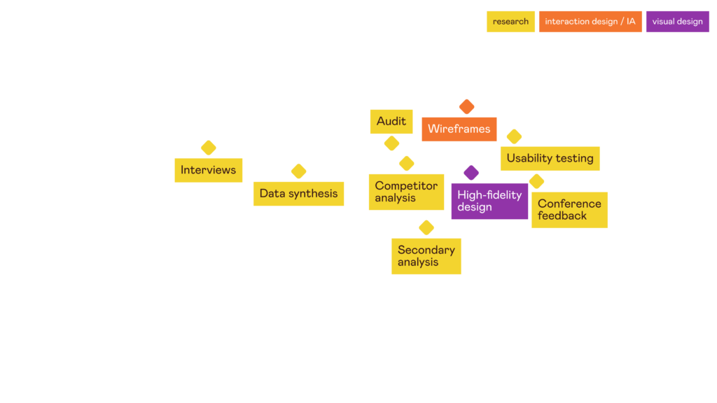
Discovery
In 2019 I was appointed as UX designer for Xperience product.
It was a strategic product decison to dedicate resources for area of digital marketing and I was part of the discovery team (with product managers, UX researcher and other designer).
Jumping into the project at the beggining, I observed research interviews and helped to synthesize research findings.
stategic desicion
↓
value proposition canvas (VPC)
↓
research interviews
↓
synthesis for VPC
↓
decision
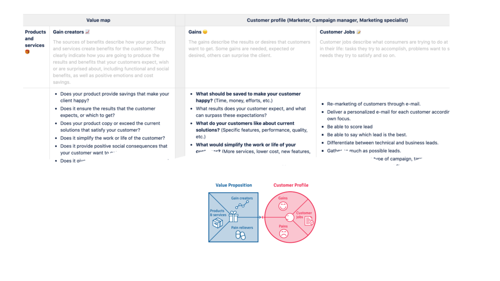
Audit & Competitive analysis
To understand better the current solution of Marketing automation (designed approximately in 2014) which is to be redesigned, I conducted an audit and concluded problematic touchpoints.
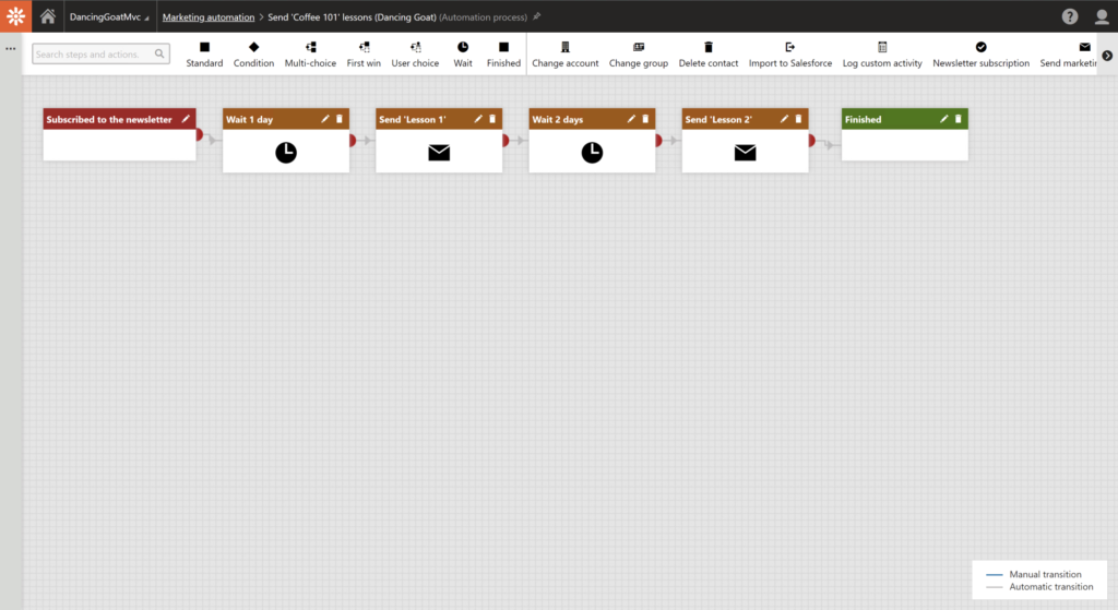
Secondary analysis
I went through existing feedback connected to marketing automation to get a better picture what challenges users deal with and if there is some specific need we need to address
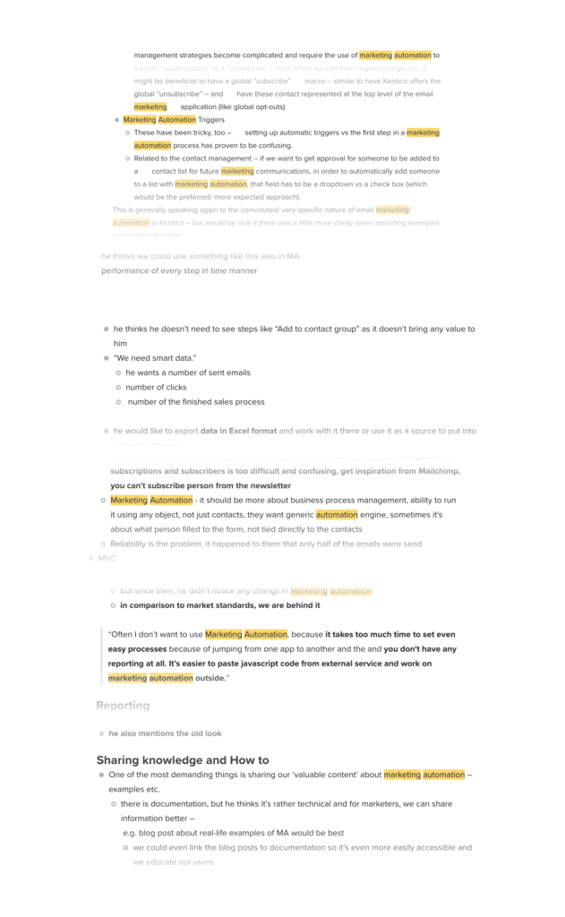
Synthesis of existing data &
Prioritization
I went through existing feedback connected to marketing automation to get a better picture what challenges users deal with and if there’s some specific need we need to address.
With PM and TL, we went through the list and labeled them with High impact, Normal impact and Low impact
| ? It’s extremely time-consuming to use it due to non-linked applications and repetitive steps or manual work (+performance issues) ? Setting up marketing automation is mainly for advanced marketers as we don’t provide much help along the way and best practices/examples ? We don’t provide error prevention which makes our users stressed ? Specific steps during Marketing automation are confusing and users don’t understand what they mean or how to work with them ? Reports/Data from Marketing automation processes are there, but, oh-so-hidden ? Visual representation of marketing automation is very outdated in terms of ease of use and visual attractivity Feature requests: Ability to easily annotate process, Start process based on a time-based trigger, ability to A/B test emails within Marketing automation (and more) |
Wireframes (lo-fi design)
With no design system to back me up, the best way how to start thinking about visualizing ideas was pen and paper, whiteboard and quick wireframes. These served their purpose mainly for discussions with PM (to validate the scope) and development team (to validate technology options).
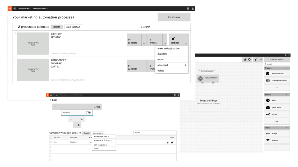
Finding solutions
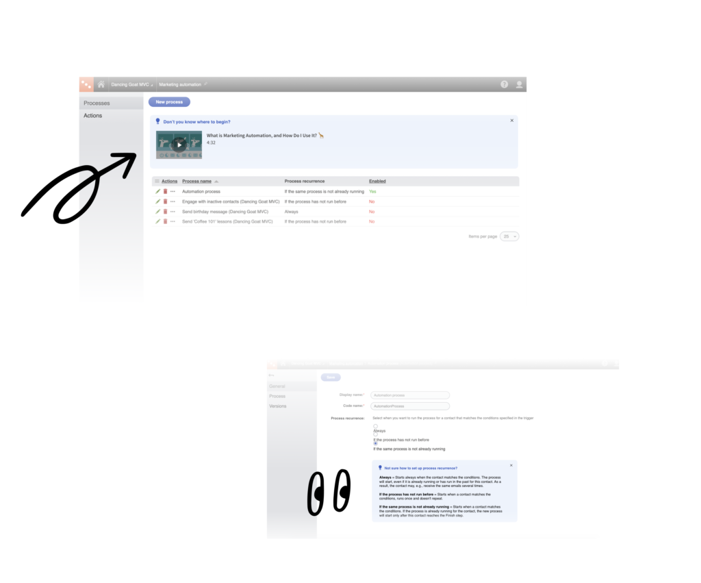
❌ Setting up marketing automation is mainly for advanced marketers as we don’t provide much help along the way and best practices/examples
? We provided a better Onboarding process and describing messages
❌ It’s extremely time-consuming to use it due to non-linked applications and repetitive steps or manual work
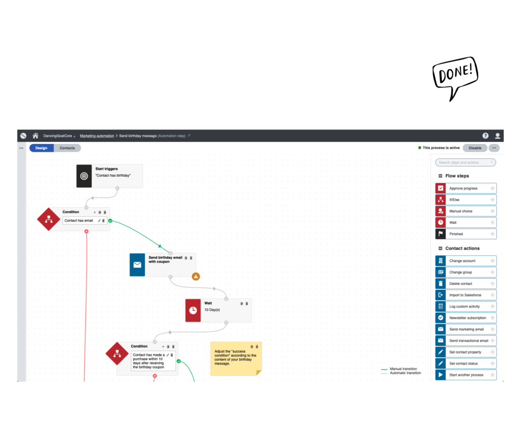
? We provided the ability to choose a template, ability to copy steps, and display important information straight-away
? We improved performance.
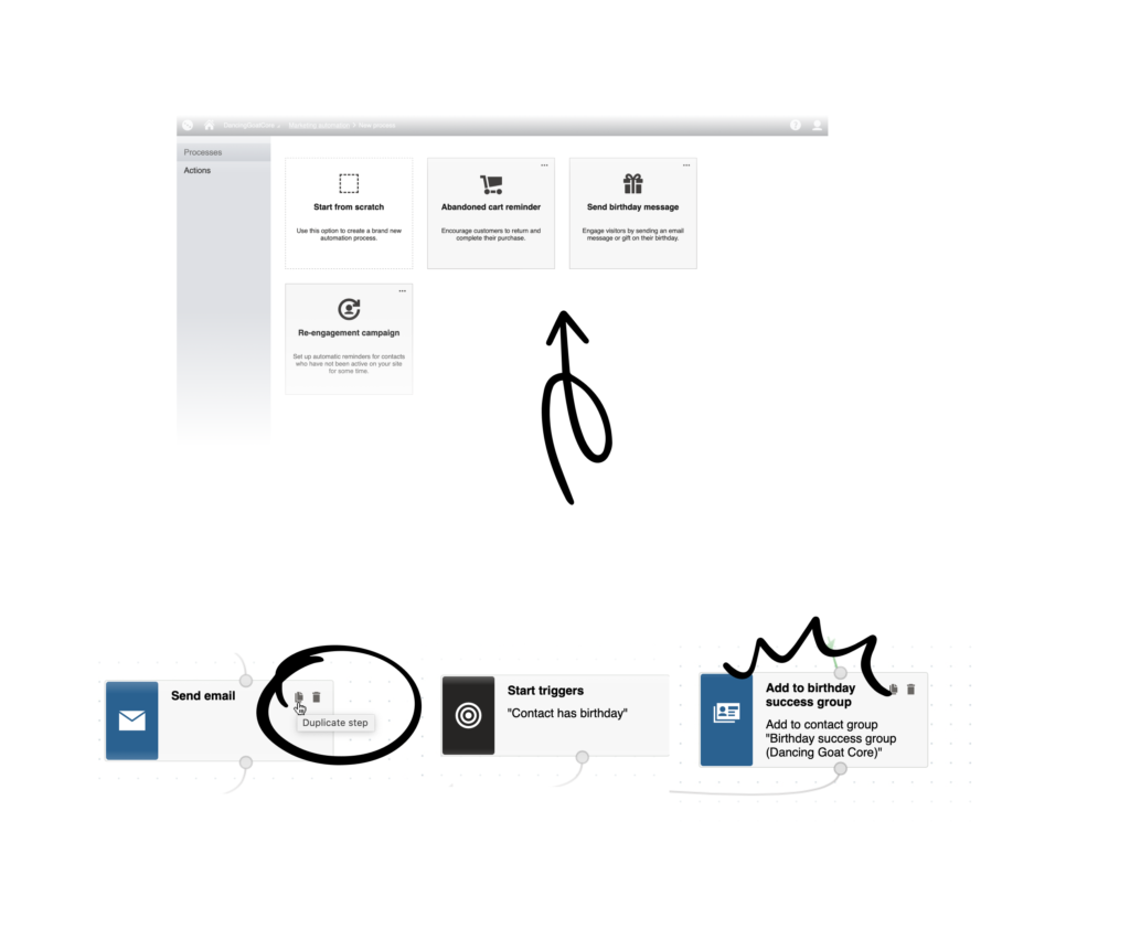
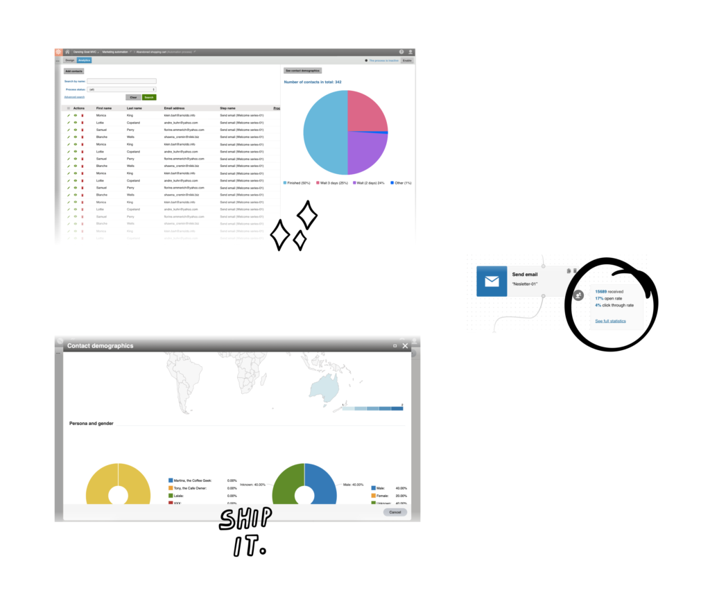
❌ Reports/Data from Marketing automation processes are there, but, oh-so-hidden
? We provided a reporting one click away with connected demographics and in-app email marketing statistics
❌ Visual representation of marketing automation is very outdated in terms of ease of use and visual attractivity
? We provided a sleek modern interface (within the visual language of the specific version)
Let’s test it
After big changes in the Marketing Automation application, while new functionality was added, usability improvements introduced and visual style changed, I want to make sure users are able to complete critical scenarios without constraints.
The design was tested with 5 participants on an interactive prototype made by developers.
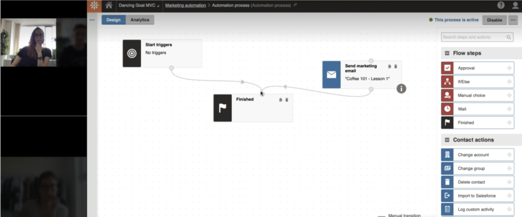
Research design ➡️ Recruitment of participants ➡️ Moderating usability testings ➡️ Synthesizing research findings
| Goals “The goal of this usability testing is to understand if critical scenarios of Marketing Automation application can be done without major obstacles.” Hypothesis H1: Users will be able to set up a simple automation flow without any obstacles meaning (i)create a new process, (ii.) set up a trigger, and (iii.) add marketing email H2: If we introduce a status message with a simple on/off toggle, users will (i) be able to find it, (ii) understand the process status, and (iii) be able to enable the process. H3: If users want to adjust process recurrence settings, they find where to set it up and will understand the wording. H4: Users will understand what all Flow step names mean. H5: If users want to check contacts’ status, they will search it under the Analytics tab in the designer canvas. H6: Users are able to find statistics about sent emails in the automation process. (H6: If users want to check a contact’s history in the process, they will be able to find it.) I think I’ll skip this. The way how to get there hasn’t really changed. Research questions “Are users able to set up a simple marketing automation process?” (H1) “are the users able to find where to enable the marketing automation process?” (H2) “Do users understand the process recurrence setting?” (H3) “Do users understand Flow steps meaning when they see it for the first time (Approval, If/Else, Manual choice, Wait)?” (H4) “Where users search for information about contacts in the automation process” (H5) “Where do users search for statistics about sent emails in the marketing automation process?” (H6) (“Is it clear where to find specific contact details (contact journey, history) and its management within the process?”) (H6) |
Feedback gathering during a conference

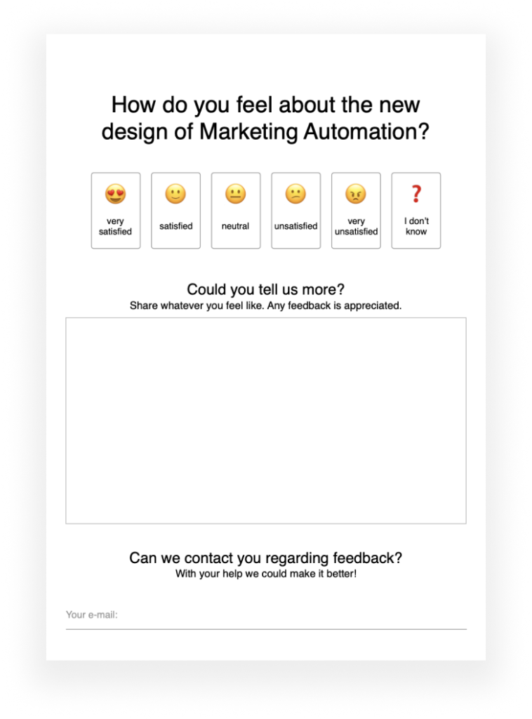
There was an opportunity to attend a conference hosted by our company so we took a chance, teamed up with the marketing department to provide some banners and merch, and had a stand where we engaged with attendees of the conference (our customers) asking for feedback.
Iterating before public release
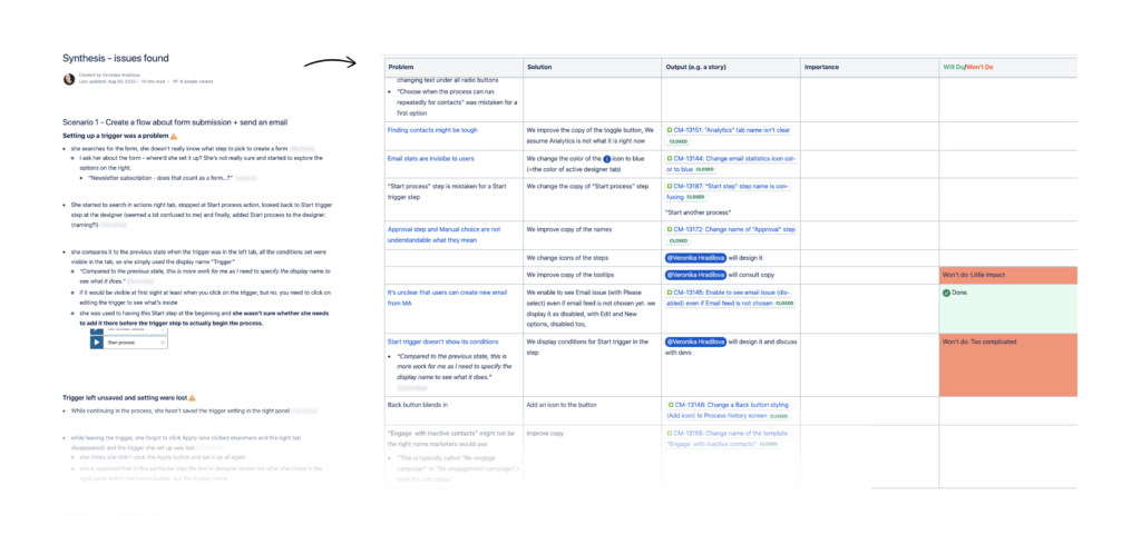
Usability testing and other feedback pointed to issues that we transformed into improvements. The most critical ones that caused most problems were fixed.
? What went well
? Design decisions were data-driven = based on user needs and market requirements.
? New design was tested and usability issues were removed, so we didn’t put anything not usable into the product.
? We worked well as a team on this project, mainly cooperating with the Product Manager and Technical Lead.

? Lessons learned
? On a redesign project of this scale, next time some before-after measuring like UMUX-lite might make sense to get data on how users perceived usability before and after redesign (though, as mentioned at the beginning, adoption of new versions are generally a long-run
? “Big bang” release once a year is really challenging for UX work as we couldn’t simply release a minimal viable product (MVP) and then test it/gather feedback, instead we worked on many improvements at once. Currently, the product is undergoing modernization and will be subscription-based only in the future.
? Lack of in-app event tracking made it impossible to track how users interact with a new design (so we couldn’t measure any engagement or task success). This and other events led to prioritizing the in-app implementation of the tracking system (while the product is being rewritten).


Want to see my next project?
✨ Back to Work ✨

