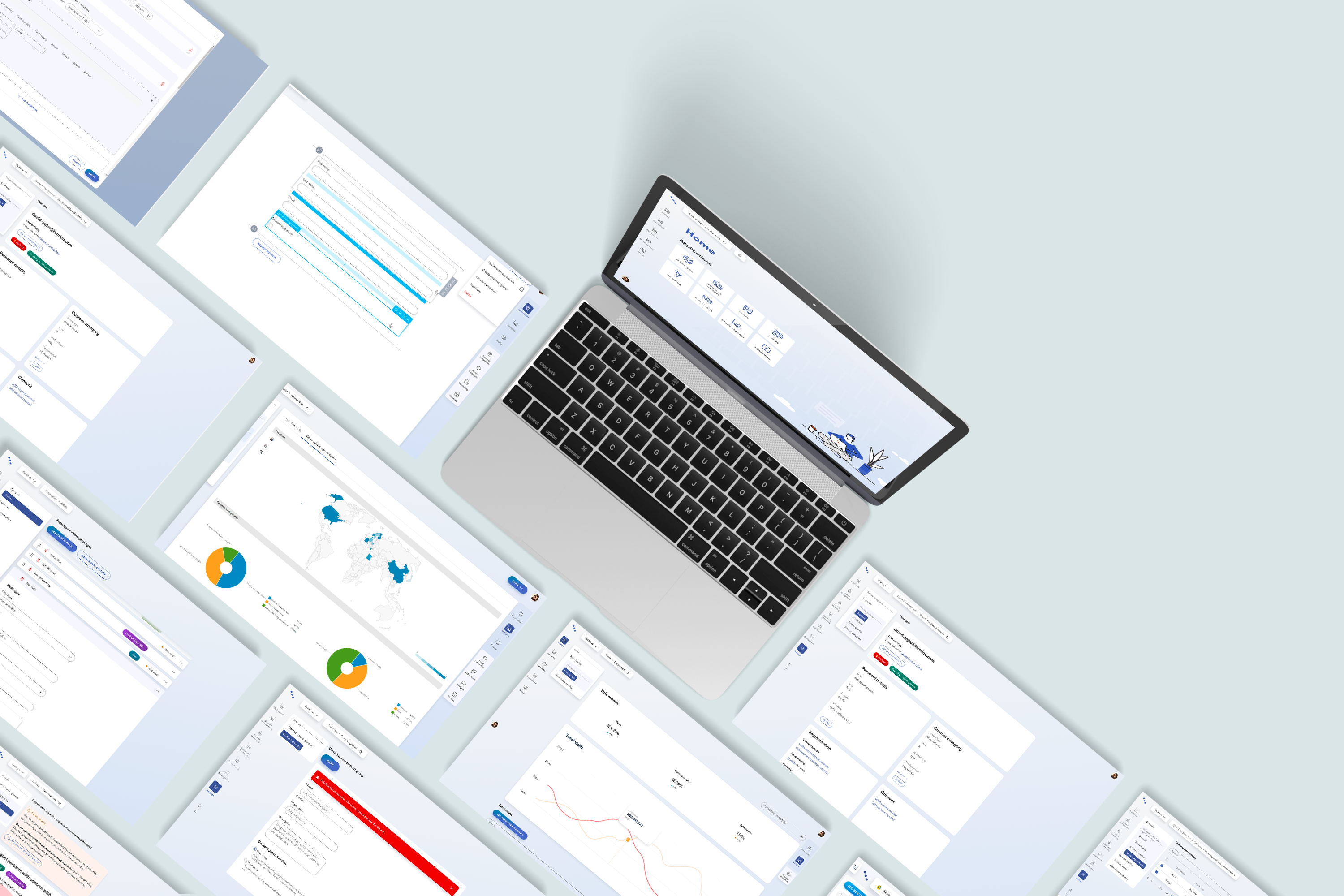
Digital Experience platform
Company
Kentico software, s.r.o.
Segment
B2B · SaaS · Content Management System (CMS) · DXP (digital experience platform)
Timestamp
2020-2022
My role
Strategy, research, high level concept, interaction design, information architecture, visual design
Achievements
Top problems and needs identified and implemented
Challenges
Lack of feedback beforehand & complex inter-communicating systems
I was mastering the perfect all-in-one tool for markters and content creators–digital experience platform (DXP).
I worked on a sum of 4 complex applications that makes together an inter-connected platform. Similarly to Hubpost or Mailchimp, Kentico users were able to manage contacts, create forms and craft emails, all of this with support of an advanced dynamic condition making.
? Context
In 2020, the base technology of Xperience product started becoming obsolete, therefore product took a sharp turn into modernizing both backend and frontend.
For designers this meant creating new interface (the previous one hasn’t gone through any major change for 14 years) and also revisiting the applications and flows – many of them designed by developers at the this early stage of product development.
Me and my team were focusing on content creators and marketers so a lot of rethinking and pruning needed to be done.
stategic desicion & OKRs
↓
understanding of the marketer’s world (exploratory interviews)
↓
secondary analysis
↓
rethinking & pruning & connecting
↓
concept & usability testing
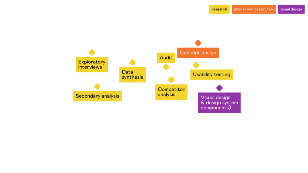
? The process
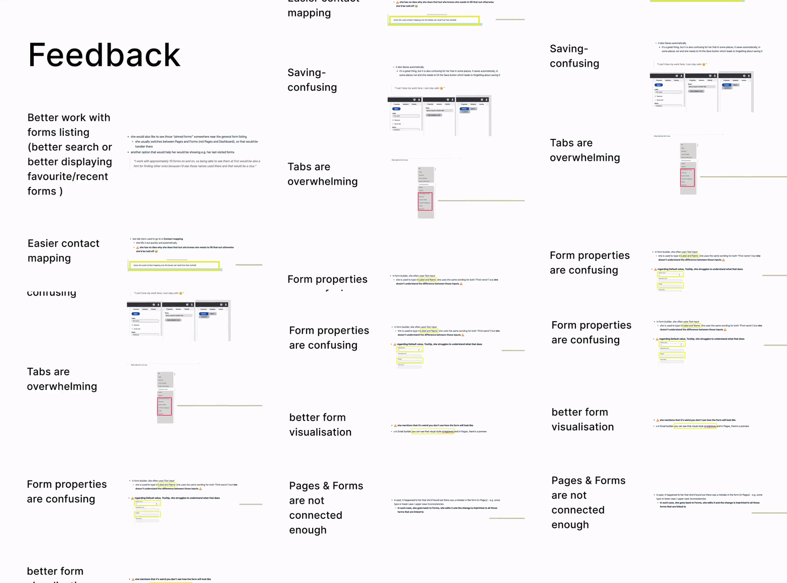
As a part of an highly autonomous team, the product trio designer (me), PM and tech lead were driving the discovery space within our segment of expertise. I was conducting exploratory interviews and did a secondary analysis–went through all of the relevant feedback. I identified the most painful experiences our user had with our tool and also what they miss or love about other tools they use for work.
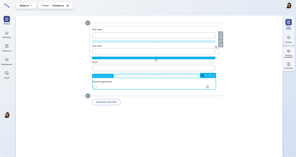
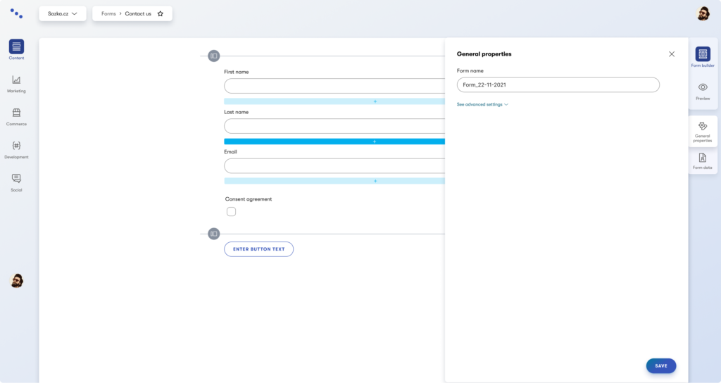
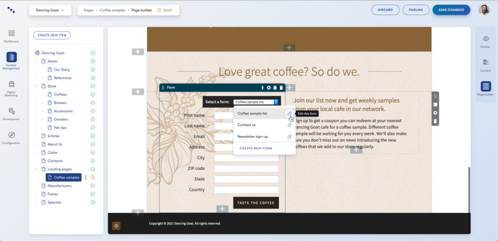
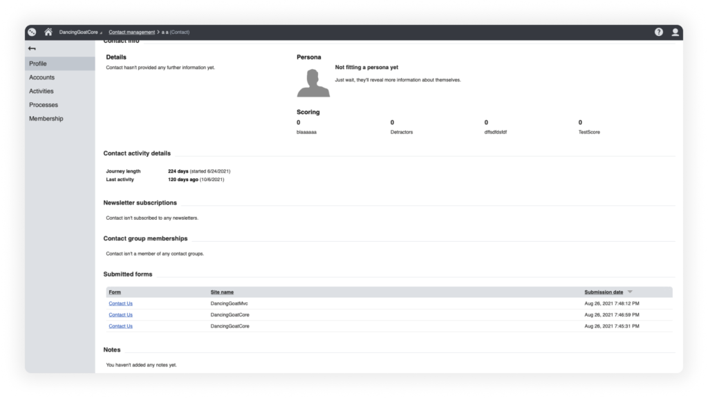
Together with the team it was decided to start off with the most basic functionality–be able to collect contacts and segment them into groups which is an underlying feature for all other applications like sending emails and managing forms. Contact profiles and Segmentation were followed by rethinking how users can easily create advances conditions (for e.g. segmentation of contacts or email sending). It was followed by redesigning how forms are being created and laying foundations for rethinking how Emails work. Two prototype testings were conducted to ensure users understand advanced conditon making and would be able to create forms.
? Challenges turned into opportunities
| Lack of feedback at the beggining As a continuous feedback gathering was a problem in past, I decided to conduct at least 8 exploratory interviews to understand the marketers’ world. Thanks to this, we undertood their workflows, pains and gains. |
| “Big bang” release As we couldn’t easily ship gradually and gather feedback continuously, I made sure, all major changes in the product were tested with users, so we keep the usability bars high. |
| One component was to fit 3 different applications From a technical standpoint, it would be much easier and faster to ship and manage one “builder” component so it was agreed that for 3 different applications we design universal complex component |
| Creating minimum sellable product As whole product needed to be rewrited into newer technology, we needed to make sure we’re creating “just enough” of a solution for our marketer persona, so that it can be actually sold. |
❤️ Achievements
Simplification
✅ Goodbye, tech jargon! We simply translated the app to marketer’s language and make it easier understandable for them.
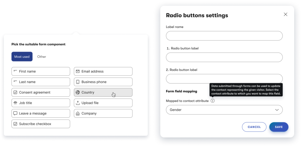
✅ Automate it. If there was a way how to make the work for them done automatically, we did it. E.g. contact mapping of the forms, that needed to be done manually in past and was very complicated for majority of our users we tested with.
Shortcuts, not workarounds
✅ Important actions done blazing fast. Super happy that we focused on connecting all important apps that marketers need. This had a huge impact on how quickly they can get the work done.
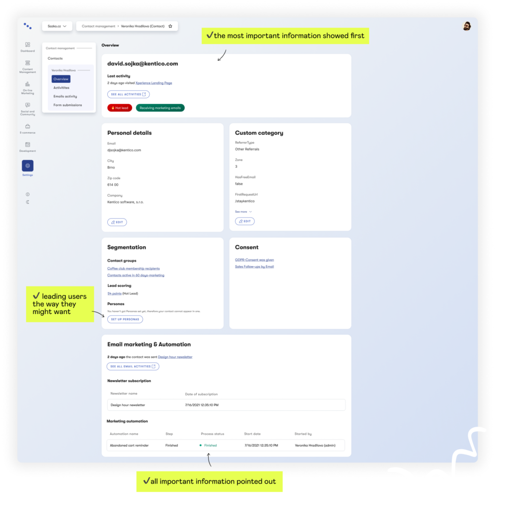
✅ Content hierarchy fixed. In contrast to the old application, we point out important or the most needed information so that users could find what they need easy and fast.
UI Modernization
✅ Beautiful. New design components made all the applications beautiful including new illustrations.
✅ Accesibility. With a new design system, we made sure we are WCAG (AA) compliant.
? Scroll through screenshots from the app
Feedback
Solutions
before
after
[smartslider3 slider=”2″]

Want to see my next project?
✨ Back to Work ✨

